
Data analysts will be very familiar with Pivot Tables. For everyone else, this newer feature added in 7.9 can be a little confusing. To help you get the most out of this Web Extra, we’ll explore a few examples to give you ideas how to leverage them.
Enabling the Extra
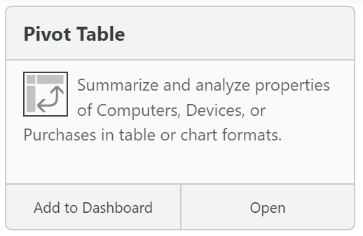
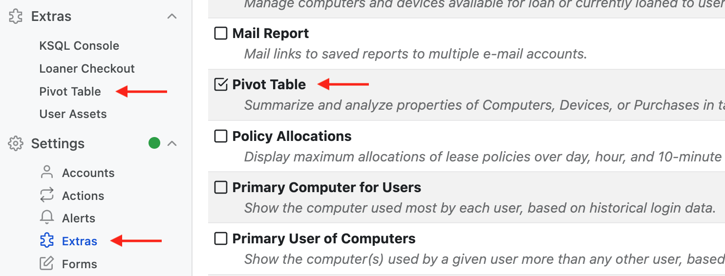
The first step if you have not used Extras in our Web UI is to turn it on. You’ll need the proper admin rights for this, so if you don’t see these options talk with your Administrator. Under Settings -> Extras you will see a list of all the available add ons in the Web UI. Simply check off the ones you wish to enable, in this case the Pivot Table. Refresh your web browser and you’ll now see Extras in the main left hand navigation. Clicking or expanding this item you can then open the Pivot Table Extra.
Using Pivot Tables
You can find online resources to teach you the full concepts of Pivot Tables, and that is beyond what we’ll discuss here.
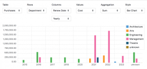
The first drop down menu in upper left allows you to choose which data Table you want to work with. You can choose from Computers, Devices, or Purchases. Next you choose the Rows data. Essentially, this is the primary grouping that will be applied to your data, and the rest of the choices will be how you look at it. Say we start with the Purchases Table and pick Department for Rows. We simply see a count (Aggregation) of the number of purchases per department, with a legend showing each department name. Fairly uninteresting so far.
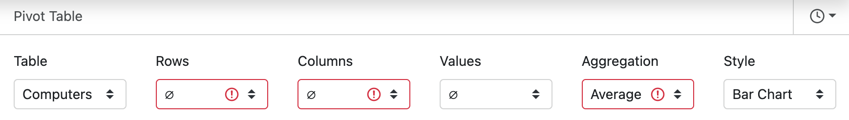
Columns is optional, but allows a second type of grouping – leading to the “table” in “Pivot Table” – rows and columns and an aggregation in each cell. In Chart view it creates groupings on the X axis. So for example, instead of just showing a bar chart of total purchases by department, you can break this down by each yearly Start Date of the purchases by department. More interesting, but we’re just just counting records.
Values allows you to perform an aggregation of a third data point within each grouping. In Chart view this sets the Y axis to this other data point. To build on our example so far, setting this to Cost with an Aggregation of Sum makes our bar chart show total cost per year of renewals by department, instead of just the total number of purchases. Now we have something interesting, because we can visually see a comparison by year by department of the total costs of operation.
In most of these pull downs you can choose the Ø symbol at the top to not apply that particular data option. This is the default when you first load up the Extra, but your prior choices will be stored locally for when you return later, so it’s good to know how to roll back to a simple start point. Note also the clock icon in the upper right. This is the History of various settings choices you have made so you can roll back to other option combinations you were playing with.
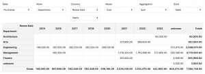
Lastly, you can change from a Bar Chart to a Table using the Style drop down (among other options). Some times a chart is a great picture, but other times it’s less useful than the “spreadsheet” style view of the data.
Other Examples
Here are a few examples of some possibly interesting pivot tables.
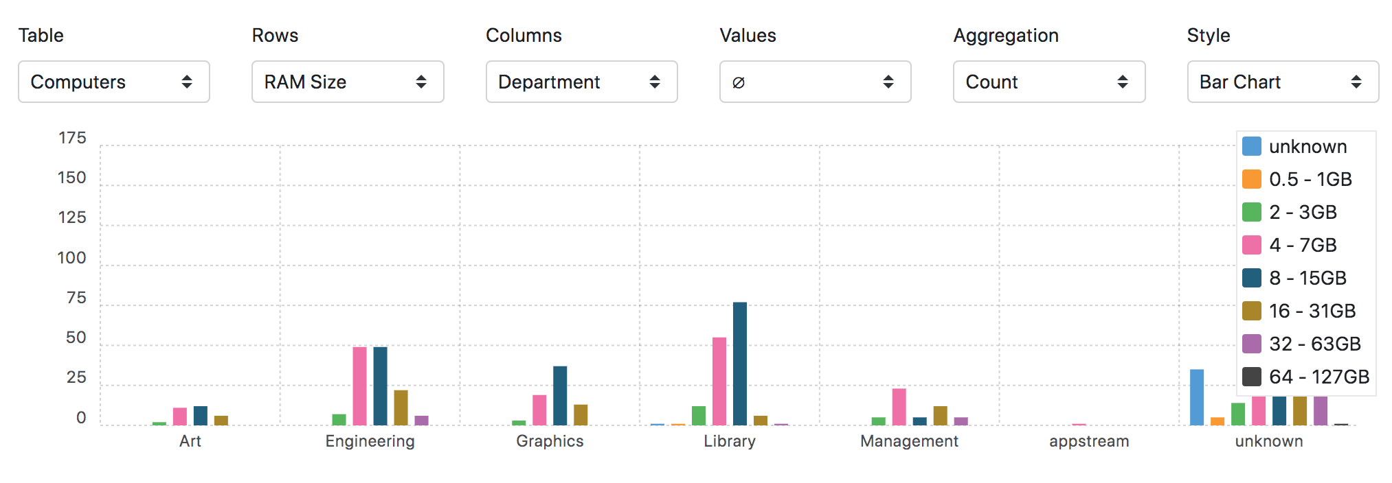
Computer RAM Sizes by Department
Average RAM size by Computer Manufacturer grouped by Department*
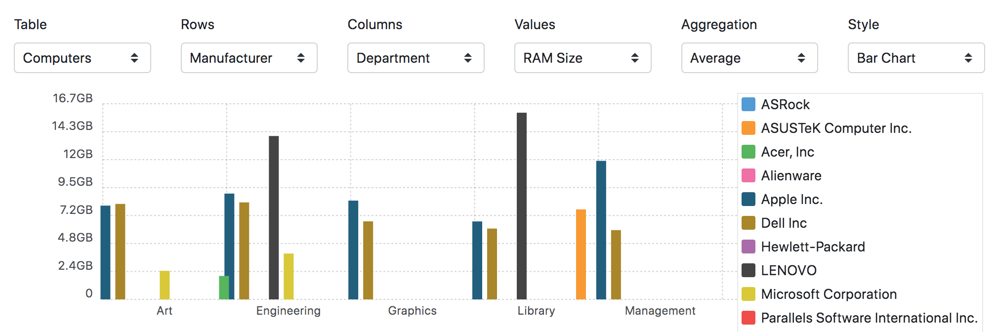
*no this isn’t a practical example per se, it just shows what you can do with these options 😉
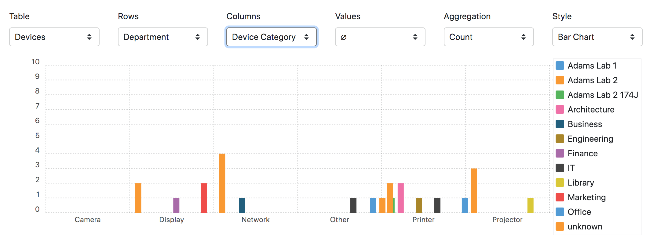
Number of Devices per Category per Department
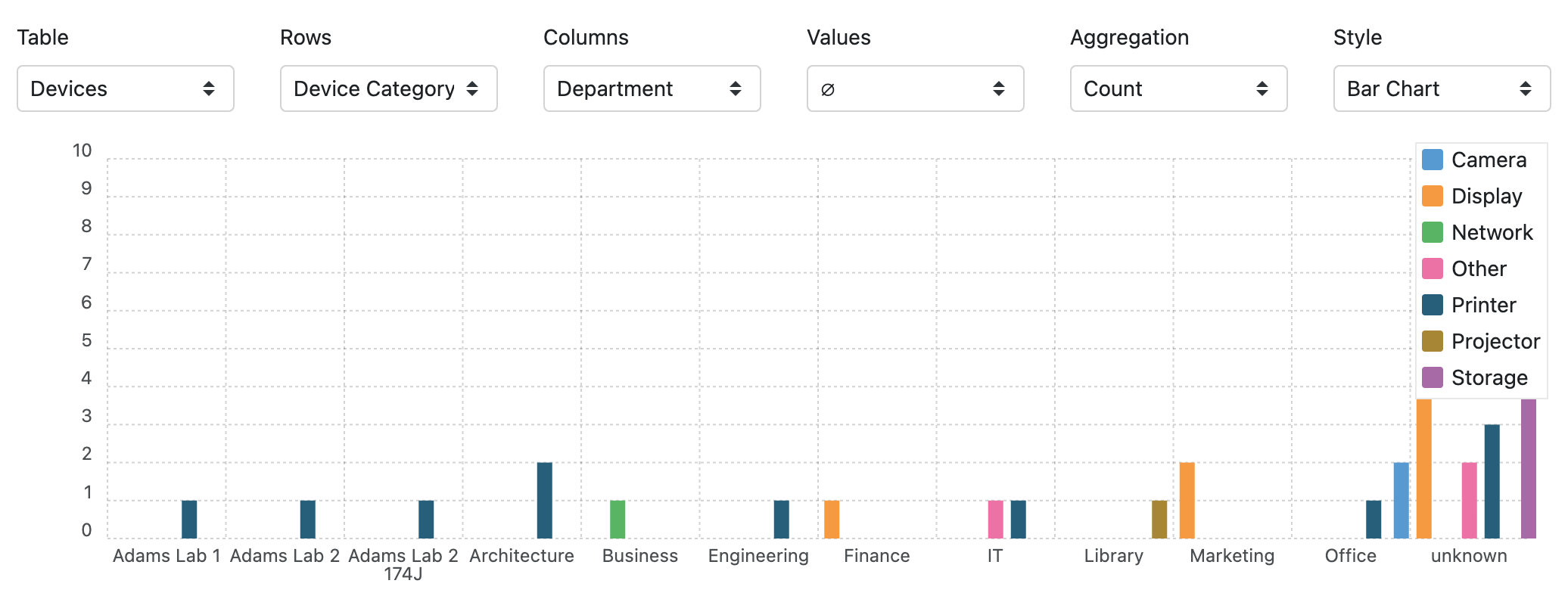
Or flip the Rows and Columns if the result seems too cluttered one way or the other:
Or again maybe the table view is simply better in some cases:
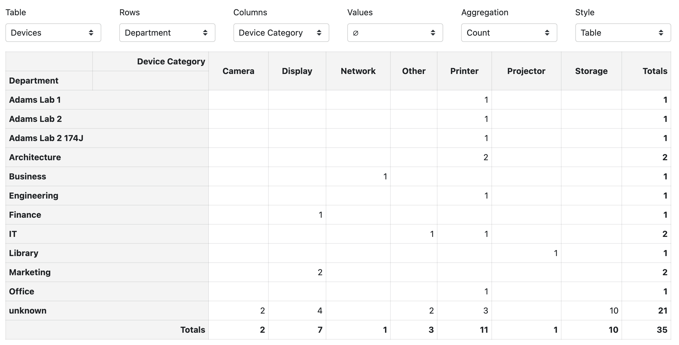
All three of these views show the exact same data, just in different ways. In any view, it’s also just a simple count when compared to our opening example. However, it’s likely a much more useful count than purchases by department, because it is actually giving you an indication of device allocations in the organization.
Computers by Replacement Date grouped by Department showing Sum of Replacement Cost
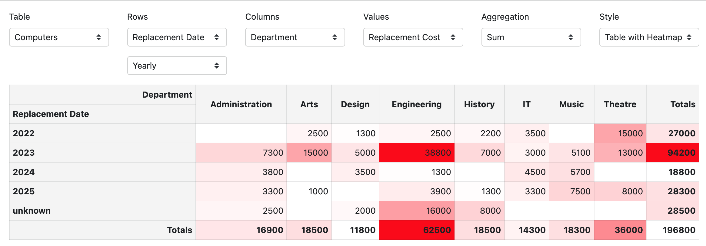
This is a rather handy example as you can see the total expected hardware renewal cost by department by year. Big numbers appear in stronger red due to the heatmap option on the pivot table choice. This also highlights the dollar amount in unknown budget planning because of missing replacement dates. That is, good data in, great data out. Missing data makes it hard to draw an accurate budget projection.
Conclusion
We hope this short walk through helps illustrate what pivot tables are capable of, and gives you a starting point to explore using them. There are many resources on the web for understanding pivot tables in greater detail as a concept. As always if you have questions about our data structure, platform capabilities, or advice on use cases, please reach out to support or your sales rep. We are always happy to assist, and want to see our customers take full advantage of all the features AllSight offers.

Subscribe
Subscribe:
Follow:


 See K2 First-hand:
Follow: