TDX ITAM Web UI
The web service of the TDX ITAM platform (called KeyReporter at the system level for older on prem customers) provides a browser based Web UI. This interface provides the majority of daily functionality for most users. Full Administrators will still find cause some times to use the KeyConfigure desktop application to work with the server and the backend data.
Note if you are an older LabSight customer some features mentioned here will not be available to you. Also if you have a delegated rights account (not Administrator Role) you may not see some features. Check with your admin first if you have questions about your access or platform feature level.
 See also our Tour of the Web UI
Main Navigation
There are a few standard areas of the Web interface layout.
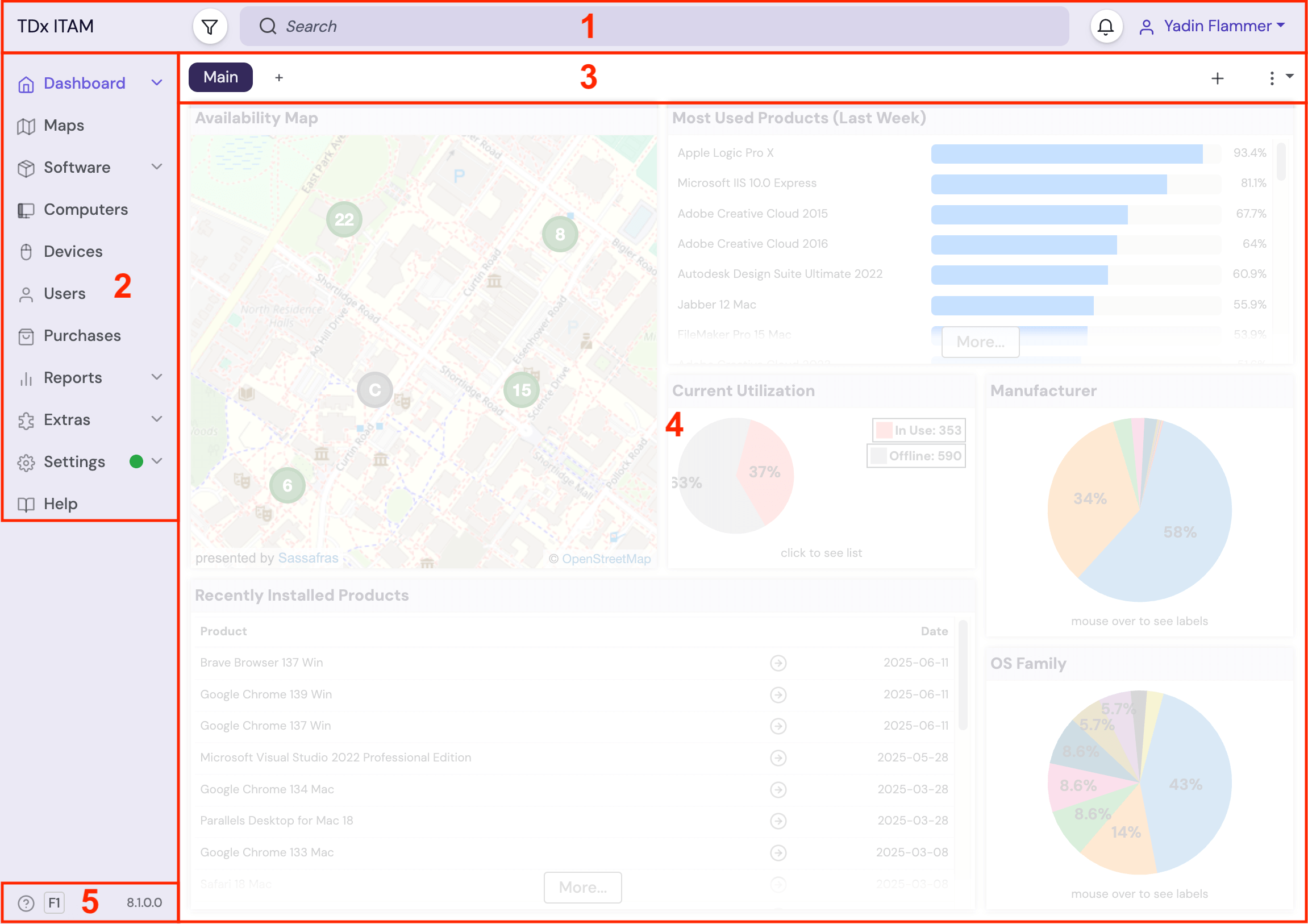
- Header Bar - The area extending across the top of the screen. From left to right this contains:
- Name of your instance. This can be changed in Settings - General.
- Scope - The funnel icon. This allows you to pick a scope for the current page, so for example the current active dashboard widgets or computer page only show data for computers in a certain Division. It will also be dynamically applied to any Report you run. Be aware of a "sticky" scope from one page to another possibly giving undesired results when you intend to shift focus.
- Search bar - find things related to the current page, like a Computer by any displayed property, result lines in a Report, etc. Depending on the page it may filter the results in the main pane, or dim all non-matching items. On the Dashboard this is a global search not in page search, and the icon next to each result indicates the object type.
- Alerts - The bell 🔔 icon. Click to see a list of all recent admin alerts, script executions, and resolve these events.
- Favorites - The star ☆ icon (available on list pages like Computers and Purchases) is a drop down showing recent and favorite items. This has drag and drop interaction to add items and pull items into fields as needed when editing a record.
- The Account drop down allows viewing account options, viewing assigned Assets, logging out, and changing light/dark mode.
- Side Navigation - The list of features on the left pane where you navigate between Dashboards, Maps, Reports, and the other lists and functions. Some items will have a disclosure triangle ^ to expand them, like Dashboards and Reports.
- Ribbon - Just below the Navigation Bar is the tools Ribbon for the current core feature you're working with. It will have tools and options appropriate to that feature such as adding tabs and widgets in the Dashboard, adding a new Map tab, or changing your Software sort order. List pages will allow you to change your Column selections. The ⁞ ▾ drop down will have more items like quick access to Reports and Scripts, saving output, Form views, and more.
- Core - The main part of the screen that contains the core feature you're currently working with, such as the Dashboard Widgets, Maps list, Computer list, Report builder, etc. This may have a sub navigation pane in some pages like Settings and Accounts. It is worth noting this core can easily be embedded in external websites, allowing external sites to show an iframe with things like Widgets, Maps, and the Software list.
- Info - Quick tour help button and current version indicator. Click the tour for a quick overview of the features on the current page you have selected.
Main Features
Note that the visibility of these various navigation items is dependent upon Roles and Priviledges. Guest (if enabled) will see only public Maps, Software, and the Guest Dashboard if that has been configured by an administrator. The built in Report Only role for example will have Printers and Computers hidden in the navigation. You can customize what is available to users of the Web UI via Roles and Groups along with ACLs.
- Dashboard
- Maps
- Software
- Computers and Devices
- Users
- Purchases - Not included with LabSight
- Reports
- Extras
- Settings
Hidden Pages
Certain data tables in the platfrom do not yet have dedicated management pages in the Web UI. You can manage these fully in KeyConfigure in the mean time. However, these tables can be seen in a raw list view in the web, and the objects are hyperlinked to their details. To view these, follow the URL syntax of allsight.server.domain/list/table where table is one of:
- program
- package
These lists are searchable using the top navigation Search.
Using the Web UI
This section will expand on the items noted above to give more details and use cases. These concepts are applicable across the various pages of the web UI.
General
Scope
Initially on a new instance when you click the scope button (funnel) it will be an empty drop down. This is because there is not yet any organized computer records in the platform. Once computers have been added, they must still be organized. The more features that are used, the more items appear in the scope menu. A mature instance will look more like this:
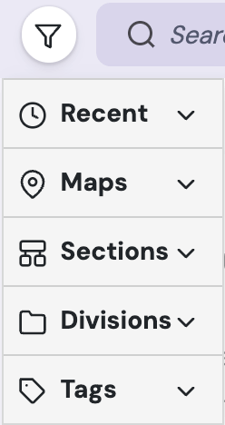
You may not build out all these items in your use case, but this shows the extent to which this is possible. Recent is of course a dynamic item based on your browsing history. Maps are covered under that main feature. Sections, Divisions, and Tags are all related to and covered under the Computers page.
Selecting any item in the Scope menu will apply that scope to the contents of the page you are viewing. This can have dramatic effects, so be mindful of having a scope applied. When something is applied, it will show after the funnel icon before the Search box. Scope will by default follow you as you navigate to other pages in the UI. To remove an applied Scope, simply click the x next to it. Some examples of the impact include:
- On the Dashboard, all data shown in all Widgets set to an Active scope will dynamically redraw to reflect the Scope.
- On the Computers page, only Sections, Divisions, and Computers that apply to the Scope will show.
- If you run a One-Click report with a Scope active, the report will apply the scope on the fly to the results regardless of the saved template settings.
- On the Software page, only software that appears on Computers that fall under the Scope will be shown, including install counts.
As you can see, this is a very powerful feature and allows for on the fly changes to the data you are viewing without any additional configuration.
Alerts 🔔
When you click the bell icon in the upper right you will get a drop down of accumulated Admin Alerts as well as Script execution information. Scripts that are still running will show their background progress. You can also see recently run scripts to verify execution history. Not all scripts will interface with this menu at release in 8.1, and some basic scripts may not update to include this as it would not be useful. Other items in this menu will include information about Product imports from PRS, license warnings, and many other system alerts. The intent is to review new alerts (icon will be highlighted) and resolve them to clear them from the menu.
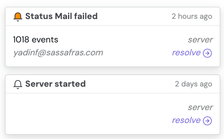
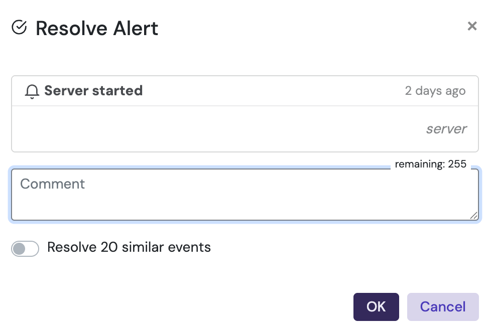
You can click the Resolve link for any given item to resolve it. If there are other alerts of the same type you will be given the option to resolve all of them in one operation. You can optionally include a resolve comment that will be recorded in the system Journal.
If you click on an item it will select it (checkbox in the lower left). You can mouse over any selected item and click to resolve all the selected items.
More critical alerts will have orange or even red icons while purely informational alerts will be white.
Favorites ☆
This little menu item is a list of Recent detail pages you have visited in the platform. It also supports storing actual favorites of your choosing. This makes for a jump list to visit items directly rather than navigating back to them. It also means you can have for example a User record in the slide out drawer while looking at the Computer list page.
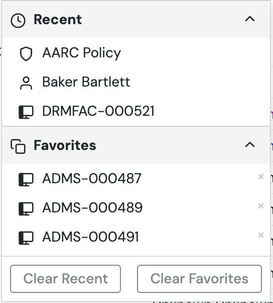
To add an item to the menu, simply drag it to the star icon in the say way you'd drag it to a folder from a list page. You can then also drag items from the drop down list into the fields of a record you are editing. You could use this to link a number of Computer records into a Purchase record for example. See more about drag and drop and the Detail Drawer in the List Pages section below.
Personal Settings
If you click your account name in the upper right you get a menu of a few options.
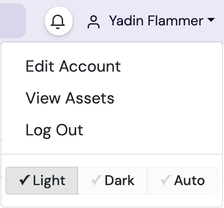
You can Edit your account, View assets that are associated with you, Log Out, and change your display mode between light and dark. For full details on editing your account preferences see Personal Settings. Clicking on View Assets takes you to a page resembling the User Assets Extra targeted to your account name. Delegated accounts do not need access to that Extra to see their own assets however.
Add +
Many pages have a big + in the upper right of the Ribbon which allows you to add an object. On the Dashboard, this opens the modal to add a Widget. On the Computers and other list pages, this allows you to make a new record in that table. Generally speaking you can add records as a test and delete when done testing. Some pages have a smaller + on the left of the Ribbon for adding tabs. Dashboard and Maps have this option.
More Actions ⁞ ▾
The more actions drop down has a variety of things that are context sensitive to the page you are on. Many of these actions are also available from the right click context menu when you use that on a record. Some items here include:
- Open the selected record in a given Form view
- Request an audit on a computer, or Anchor a computer in a Division
- Run a script on the selected record(s)
- Add the selected record(s) to a Report builder of the selected type
- Import records from a CSV or Excel file
- Download the current list of filtered records
- Duplicate the selected record
- Delete the selected record(s)
- Return to the Report Builder to create a Similar report using the same options just used
- And more depending on the page you are currently on!
Resizing Columns ◫
This applies not only to actual columns on list pages, but also the main UI itself. For example, on the Computers page if the dividing line between the Division etc. list and the main pane of computer records is too narrow, you can't see the computer counts. Making that column wider allows you to see the count information which is very useful. On the Accounts page, making that divider wider allows you to see account types and even external linked groups on Roles. VERY useful and easy to miss if you don't know it's there. And of course if you are cropping text in the Report Builder, just make that wider so you can see all the details.
Columns themselves on List pages can also be resized of course. But pro tip, if you right click on the column headers there are options to resize to content. Rather than fiddling each column when you have 20 turned on, you can resize them all with one click so they scale to fit the largest data entry they contain.
List Pages
Many of the pages in the Web interface have a list layout that have common use features. List pages include but are not limited to Computers, Devices, Purchases, Users, Policies, and Models.
Sidebar
At the far left of the Ribbon when on a List page you'll see a little icon before "all in scope" or text relevant to the applied scope and filter. That icon toggles the sub navigation page for the list page. So if you suddenly find your list of folders has vanished, don't panic, look for that button to toggle the display. As mentioned above, make sure this is sized well so you are not cropping off information. If the sidebar is too narrow you can't see computer counts in Divisions for example!
Drag and Drop and Selection
It bears mentioning that much of the UI is drag and drop enabled. This may seem obvious on the Dashboard for moving and resizing Widgets, but it also applies to list pages for records. You can simply drag a Computer to a Login state, or a Purchase to a folder. You can shift+click records to select all line items between the one clicked and the one already selected. You can control/command click (Windows vs Mac) to select non consecutive items. These should be familiar conventions just like working with files on your computer. Note that if you click on the Name of a record you will open the Details pane of that record. If you click anywhere else on the row, it will select the row.
Right Click
Many areas of the web UI are right click enabled. If you right click and just see the generic browser options, then it's not a special item. If you see our UI with options, then it has context capabilities. There are several things you can do from a right click depending on the thing you right clicked on:
- Many items listed above in the More Options menu are context available
- Rename or Edit a Division or Filter
- Copy the content of a "cell" on a list (e.g. the Serial of a Computer)
- Make a new Division under the clicked Section
- Other things depending on the page and object!
Filtering (but not Filters)
You can select any item in the sub navigation pane on any list page to filter the display of records in the main pane to only show what is in that container/category/tag/etc. Multiple things can be selected in each navigation group, like a device Category and a Division to narrow the results further. This filtering of displayed records is not to be confused with using the actual Filters. While Filters can be used the same way and in conjunction with other filtering, they are advanced criteria items with their own capabilities. You don't have to use a Filter to filter the display of applicable records, but you can.
Folders
All List pages offer Folders for organizing records. On the Computers page these are called Divisions but they still have the Folder icon. The reason for this is the importance of Divisions due to various Report modules, the fact that they can be nested unlike other folders, and they can be allocated to Sections for access management. Because they are special, they have a special name, but the basic concept is the same. More about Divisions and Sections is on the Computers page. Devices use the same Divisions as managed on the computers page. Things like Purchases, Policies, and Users can use folders in any manner needed. Many sites will never use them if there simply is no use case. Purchases for example might be put in folders by Department so ACLs can be used to prevent cross department access to financial information. Users could be put in folders to indicate if they are staff or student, and then use those folders are targets in certain Reports for usage information.
Columns, Grouping, and Views ◫
All list pages and even some list related pages (Windows Updates Extra) have the columns button ◫ in the upper right. This opens a modal to choose which data columns you want to view, and in what order. Simply drag and drop to arrange as desired. There is also the Group By drop down that will let you pick from a more limited number of columns to use a grouping. This can be useful if you wanted to group all computers by Model then sort by the RAM column for example to compare various records.
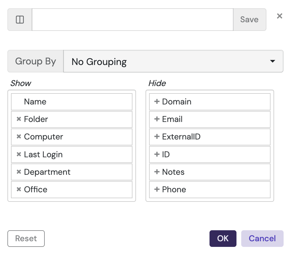
At the top is a box with a Save button. This lets you save a personal view present with the grouping and column choices you have made. Rather than re-select a bunch of options each time you change to a given task, you can simply use the presets to switch all the settings. The Reset button will go back to the built in defaults for this list page.
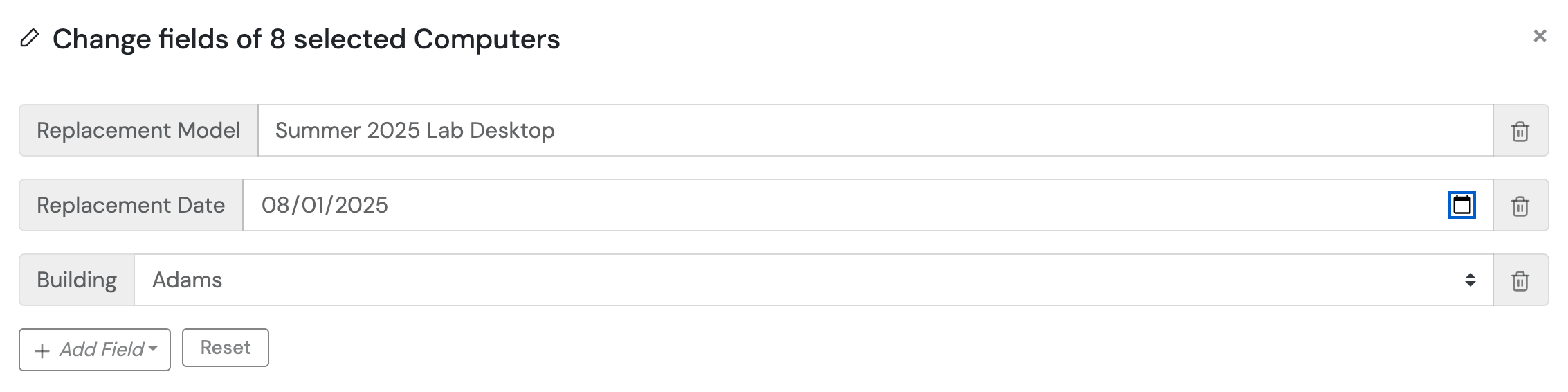
Quick Edit ✎
One of the options when you right click on one or more records on many list pages is Quick Edit. This allows you to change any number of record fields on the selected records at the same time. Simply add and delete fields as needed to make these bulk record updates.
Details Drawer
When you click on the Name of any record on a List page, a details drawer will slide out from the right side of the screen. This contains the details of that record, and has its own navigation sidebar that breaks out those details into sections. While the drawer is open, the Search and Ribbon tools will operate on the detail record not the list page in the background. You can drag this slider wider or more narrow as desired. The x in the upper right closes the drawer. You can simply click the name of another record to see its details without closing the drawer. In older versions of the platfrom, these detail records opened in the main pane rather than a slider. This new UX allows you to more quickly switch between detail records.
Filters
If you need to construct a complex set of attribute search criteria, you can use a Filter. For example, all Dell computers that use nVidia cards with less than 2gb of VRAM. When you click to create a new filter in the web UI, you get a modal where you can simply select fields and set the logical criteria as desired. You can move past the simple GUI builder if needed by clicking the Edit button for more advanced syntax. Those advanced parameters are discussed on the dedicated Filters page. When working with Computers, you can move a Filter to the top section that exists only on that page to turn it into a Rule, also discussed on the dedicated page.
Tags 🏷
Several list pages support Tags. These are a meta data that can be added to records in any number. A dedicated page has more details on Tags and working with them.
Further Topics
- Enabling HTTPS (SSL) for KeyReporter
- Embedding Web Objects - Using Widgets and Maps in external websites
- Built-in Reports - List of all reports
- Report Builder Window - KeyConfigure Report building
- REST API for KeyReporter
- Internal vs Exported Data Source
- Table Structure: internal & exported
- Guide to Usage Events
- KSRViewer - Offline Reports Viewer